
VICTORY THROUGH IDENTITY
Define your identity, find your voice and tell your story.
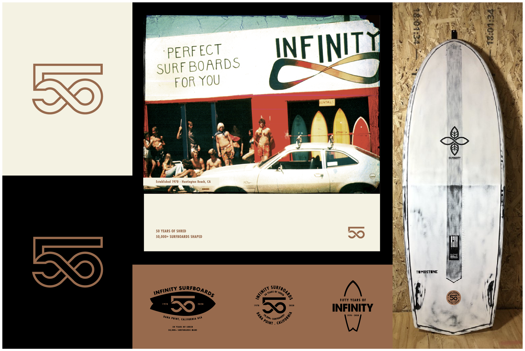
50 Years is a major milestone, and one that our long-time client, Infinity Surfboards wanted to celebrate and commemorate with a special identity to be rolled out all year long. We worked on a system of elements to support the main mark that could be used on surfboards, on apparel, in print and on social media.
INFINITY SURFBOARDS 50th Identity SYSTEM & BRAND COLLATERAL
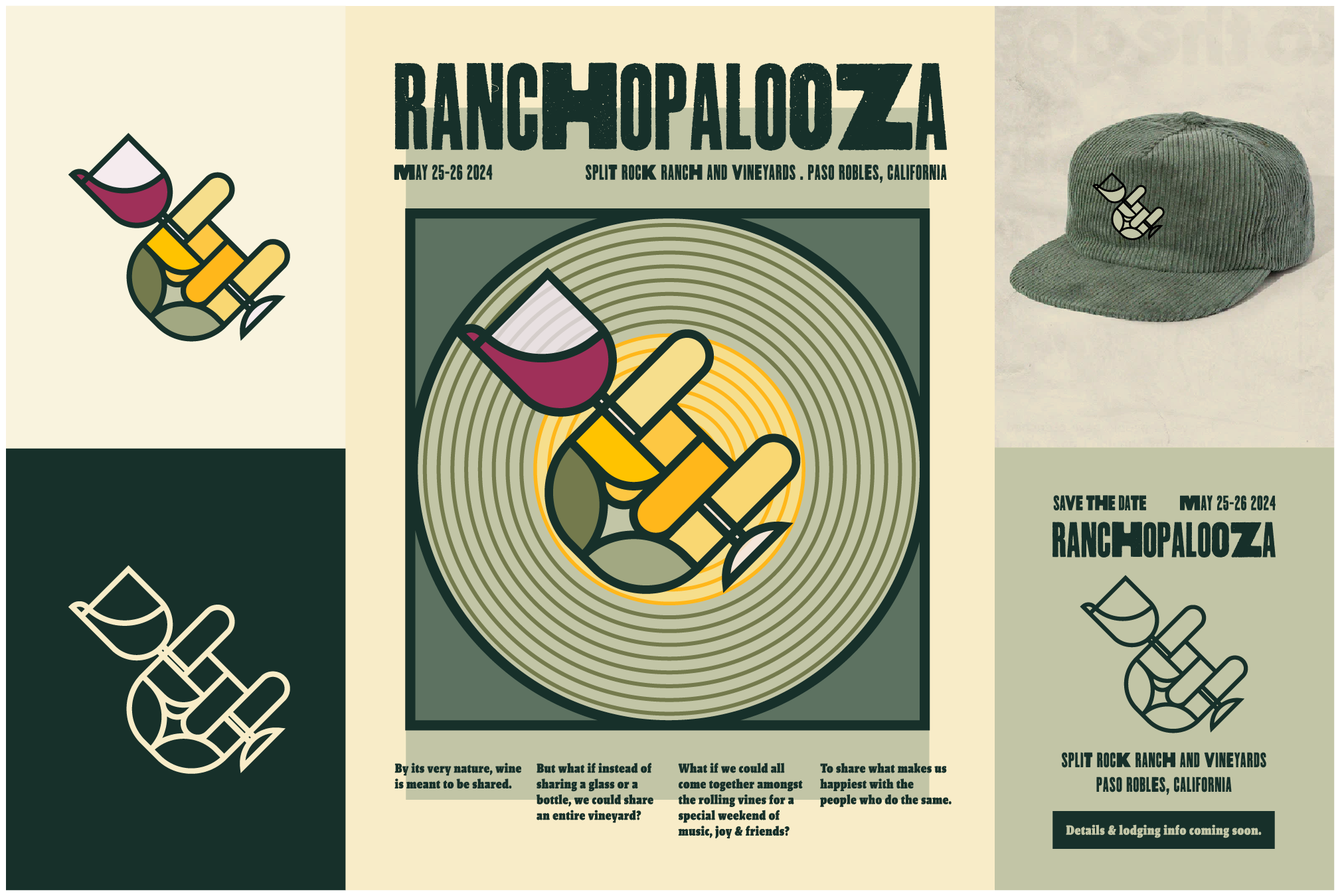
Our clients at KAA architecture firm commissioned us to design their Ranchopalooza event identity. This multi-day event hosted their clients, friends and family at their ranch in central California. The identity was used on merch, invites, posters and on-site signage.
RANCHOPALOOZA Event Identity & BRANDING
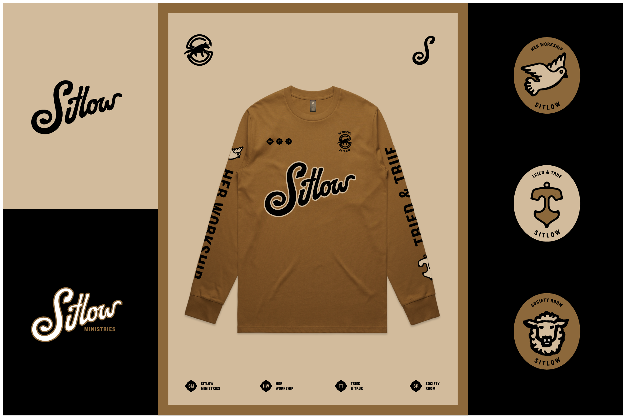
SITLOW Ministries needed an identity system for the organization, we well as it’s sub-ministries. The identities are being used to promote their message on physical products, as well on digitally online.
Sitlow Identity SYSTEM & COLLATERAL
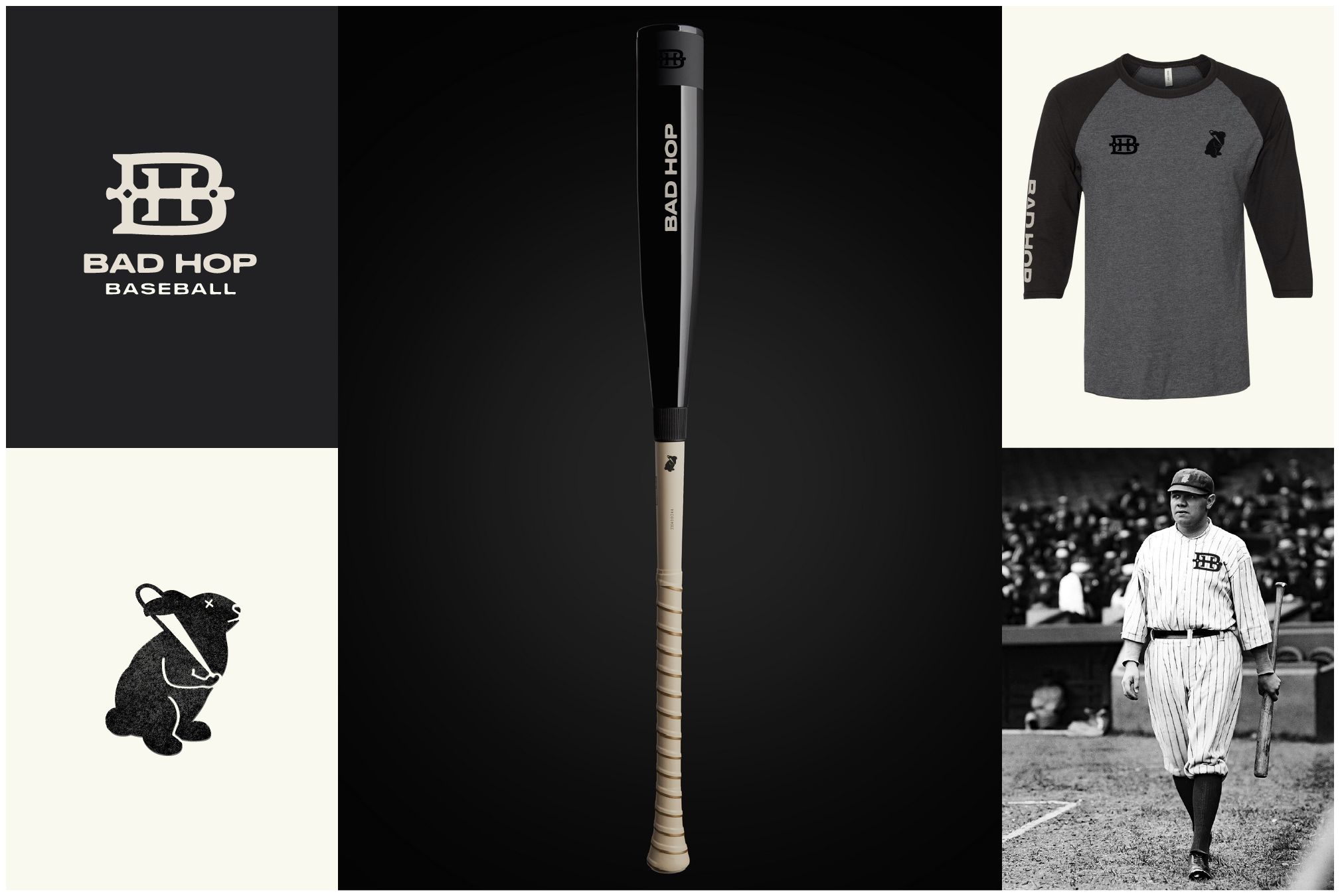
Bad Hop Baseball was in need of an identity to help launch them into the baseball apparel and product space. Taking inspiration from baseball’s rich tradition of monograms and mascots, we had fun putting together this flexible identity system for Bad Hop.
Bad Hop Baseball Identity
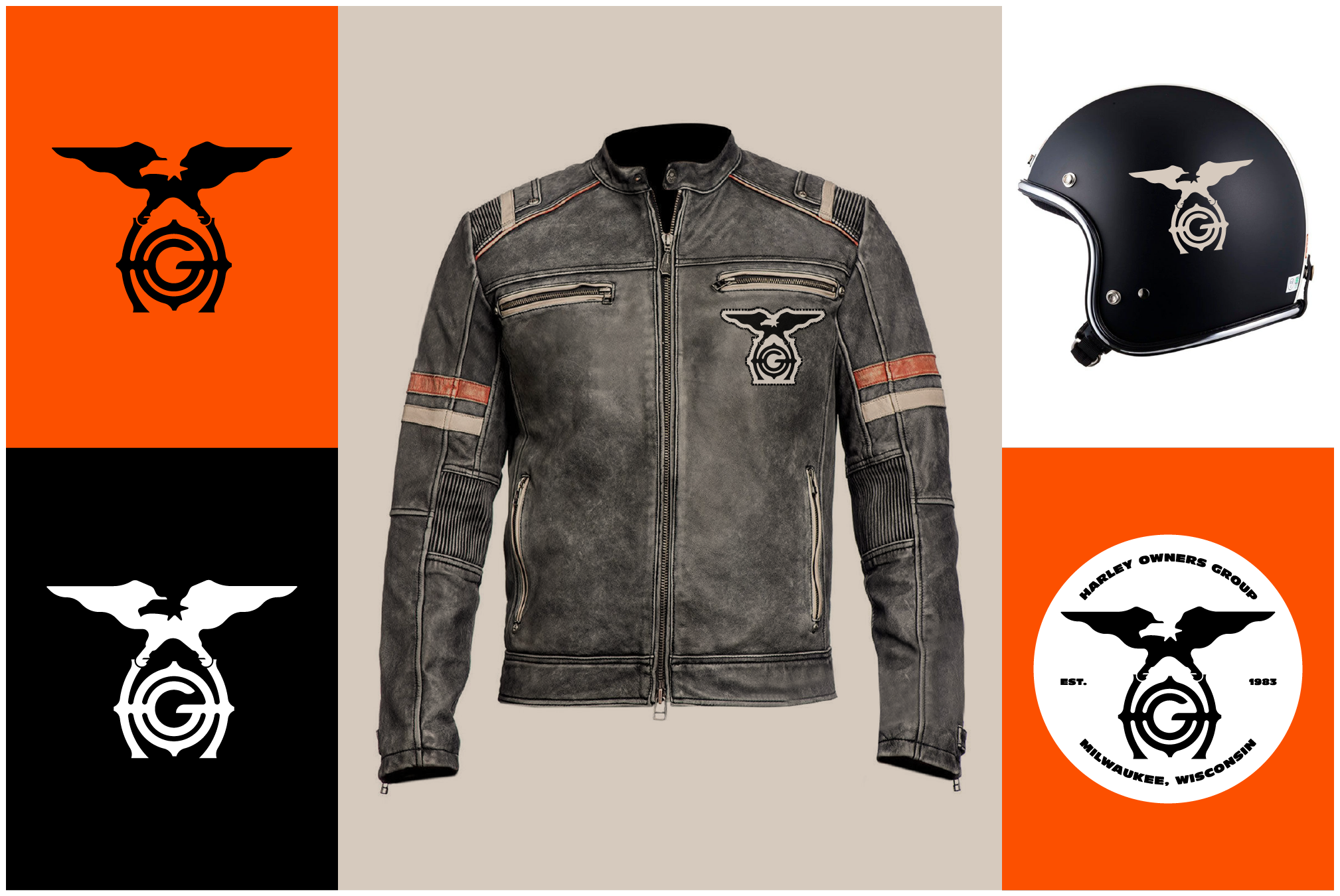
Harley Davidson was looking to rebrand their HOG organization, and we were asked to design a new mark to represent the Harley Owners Group. This mark was one of the finalists, but at the end of the day, HOG decided to go with an evolution of their past identity.
Harley Davidson Owners Group Identity
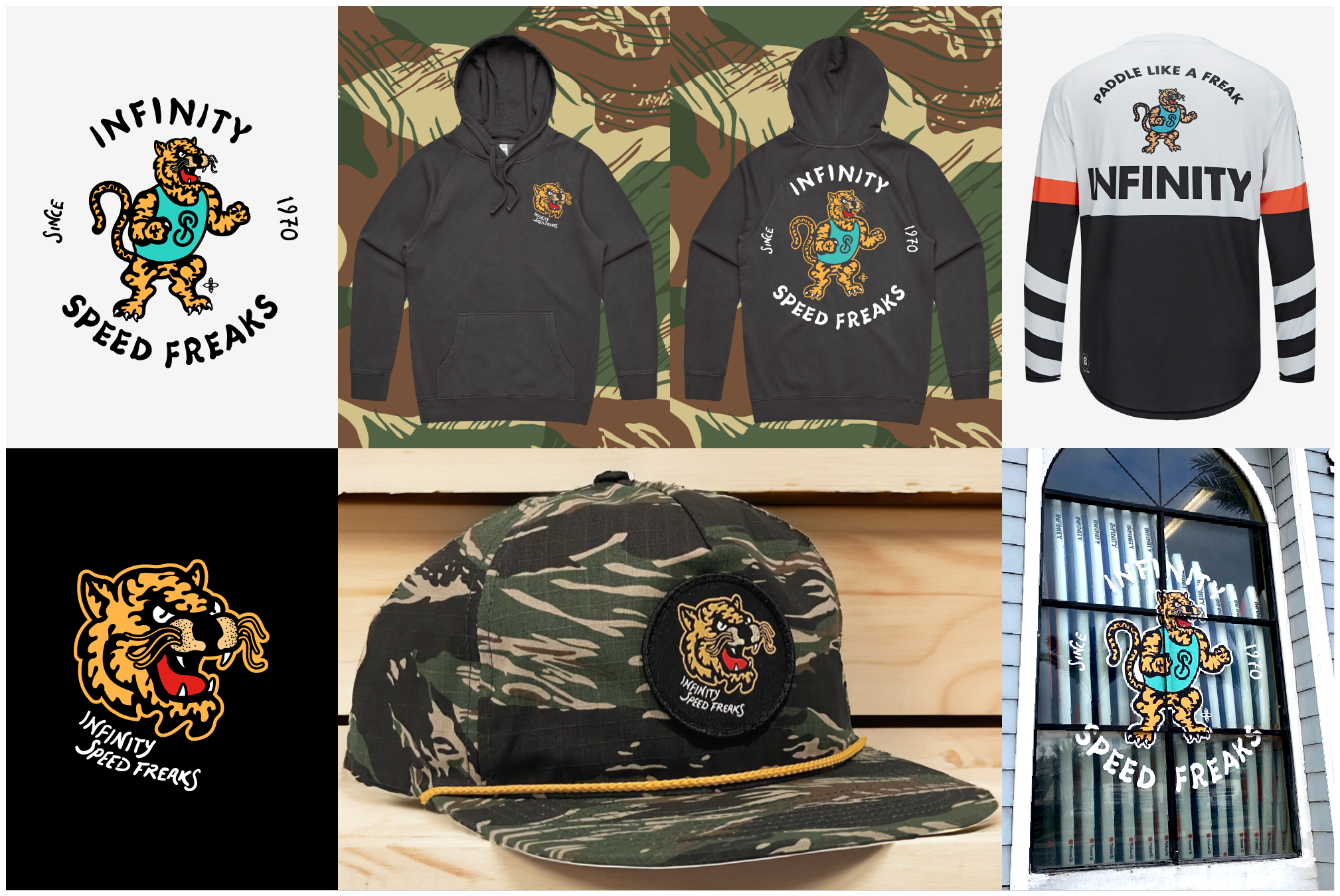
Infinity is a leader in the SUP race and surf markets. They needed an identity to brand their team, and ethos, “Speed Freaks.” We designed a mascot system with hand-done typography for them to apply to lifestyle products, race-wear, at retail and online.
Infinity Speed Freaks Identity
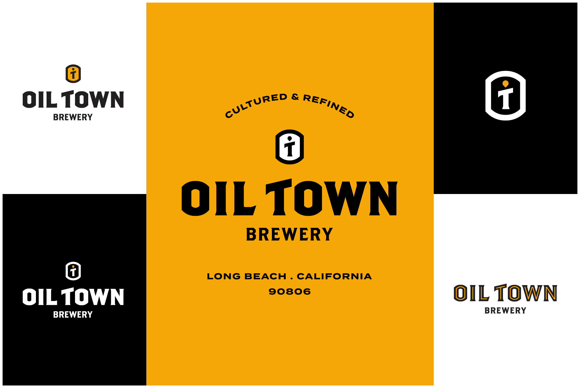
Oil Town Brewery was started by a Long Beach Brewster, and he needed an identity to represent is new passion project. Drawing upon Long BEach’s history as an oil town, we developed a foundational identity system with custom typography, iconography and copywriting.
Oil Town Brewery Identity
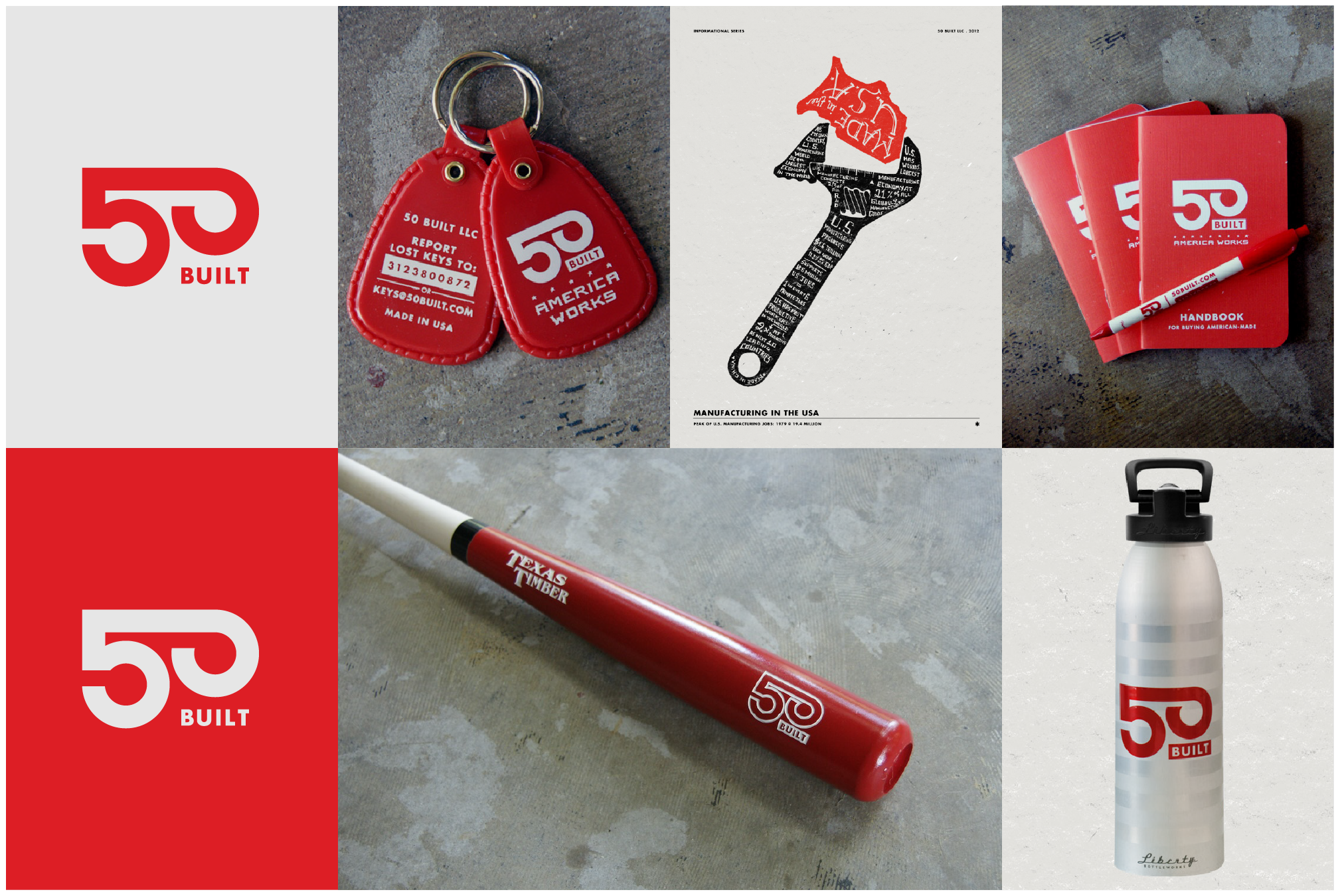
50 Built is a journal for all things American made. We created a bold identity inspired by the machinery and tools that built America. The full scope of the project included application to printed collateral, products, collaborations and for the web.
50 Built Identity
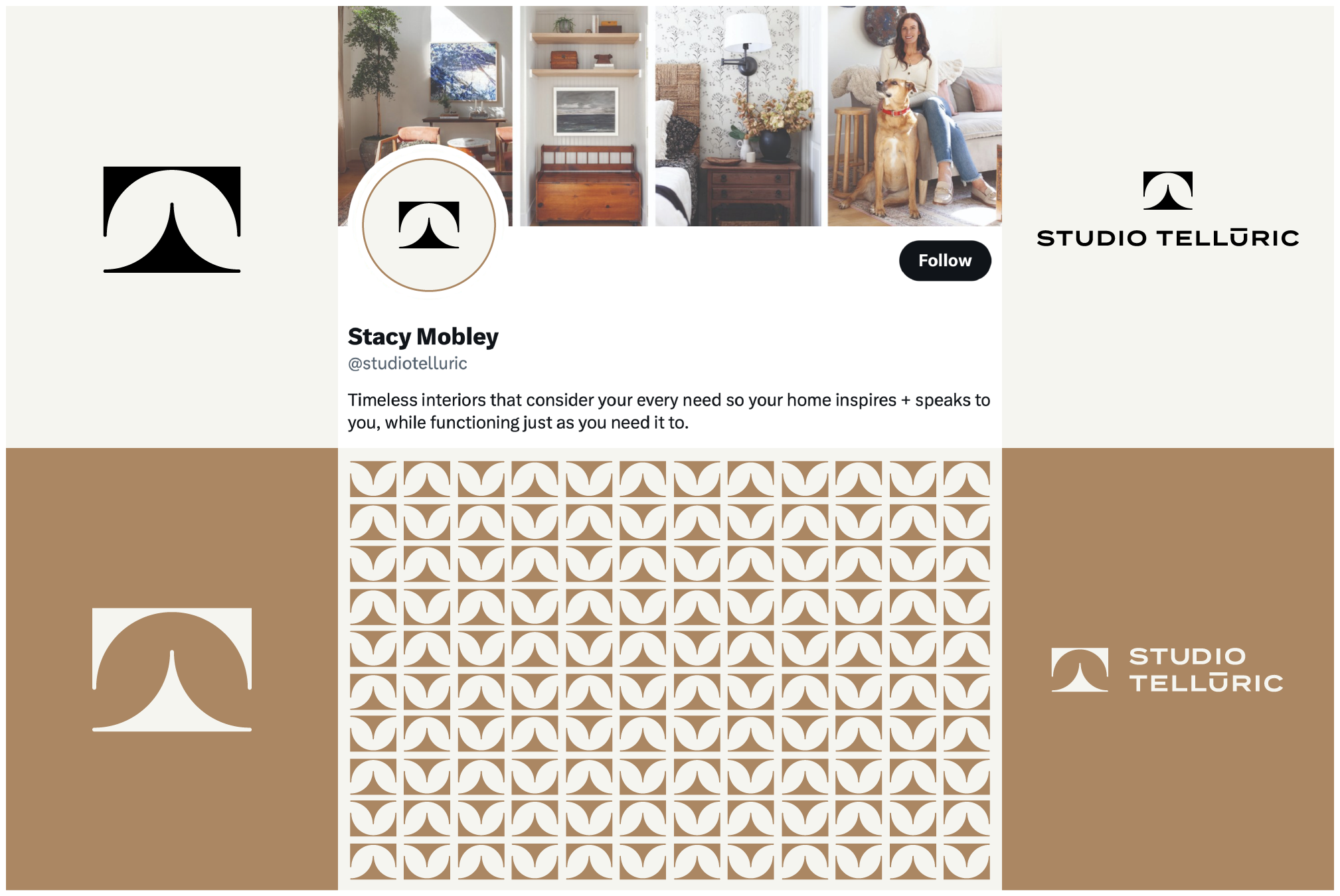
Stacy Mobley is an interior designer from Southern California. After rebranding her studio from her name to Telluric, she needed an identity that refected her, and her studio’s work.
Studio Telluric Identity
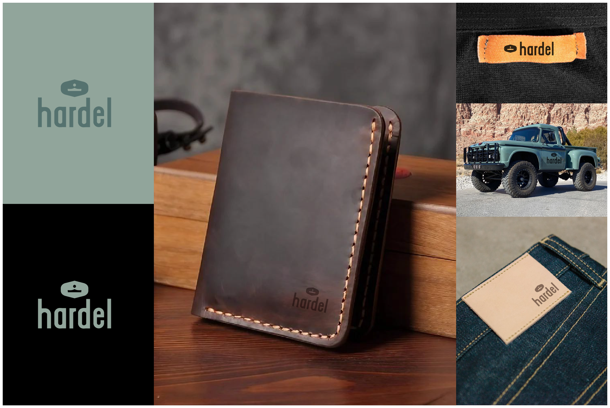
Hardel was formed to honor the ancestors of the founders, and the hands-on craftsmanship they represented. We helped with naming, and created their identity to be used on the leather goods and accessories that they produce.
Hardel Identity
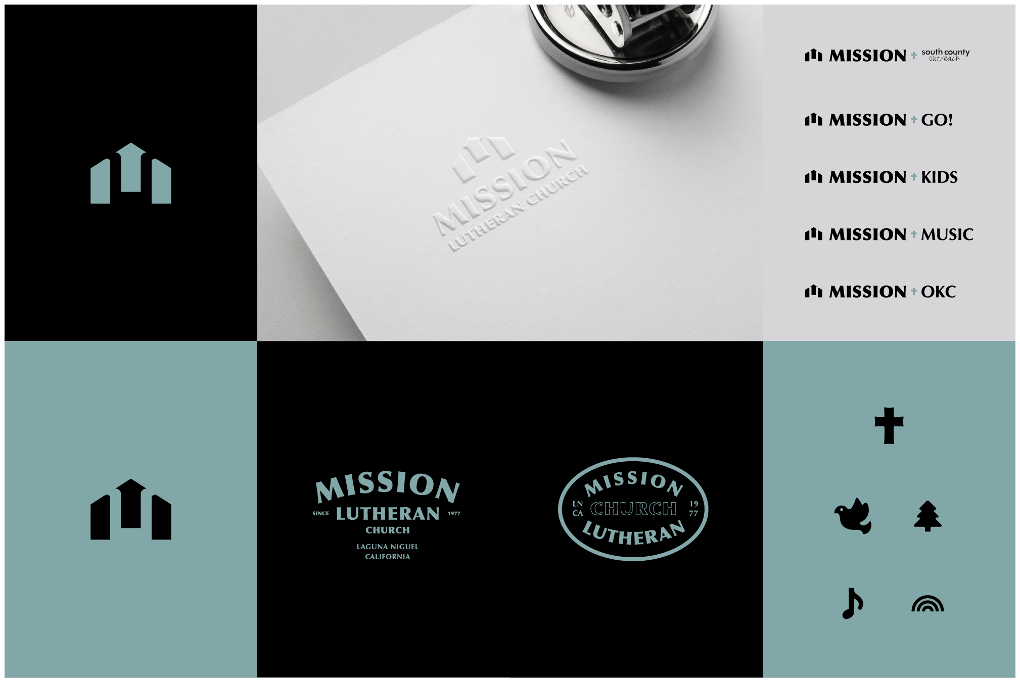
Mission Lutheran Church was a church in transition under new pastoral leadership, and they wanted to new identity system to represent them into a new era. Full identity system, iconography, campus collateral were a part of this project.
Mission Lutheran Church Identity
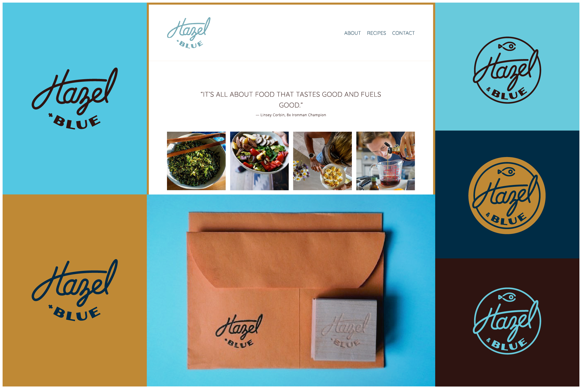
Hazel + Blue was founded by Ironman and Triathlete, Linsey Corbin and her husband Chris Corbin. Taking Linsey’s knowledge and experience as a peak-athlete, she creates and shares her recipes for a healthy lifestyle.
Hazel + Blue Identity
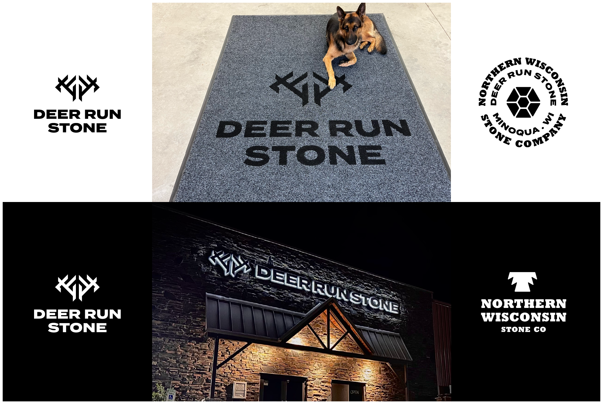
Deer Run Stone, and parent company Northern Wisconsin Stone Co. were under new ownership, and wanted a new identity to lead them into a new era as they re-designed their showroom and all of their company collateral, work trucks, online presence etc.
Deer Run Stone & Northern Wisconsin Stone Co. Identities
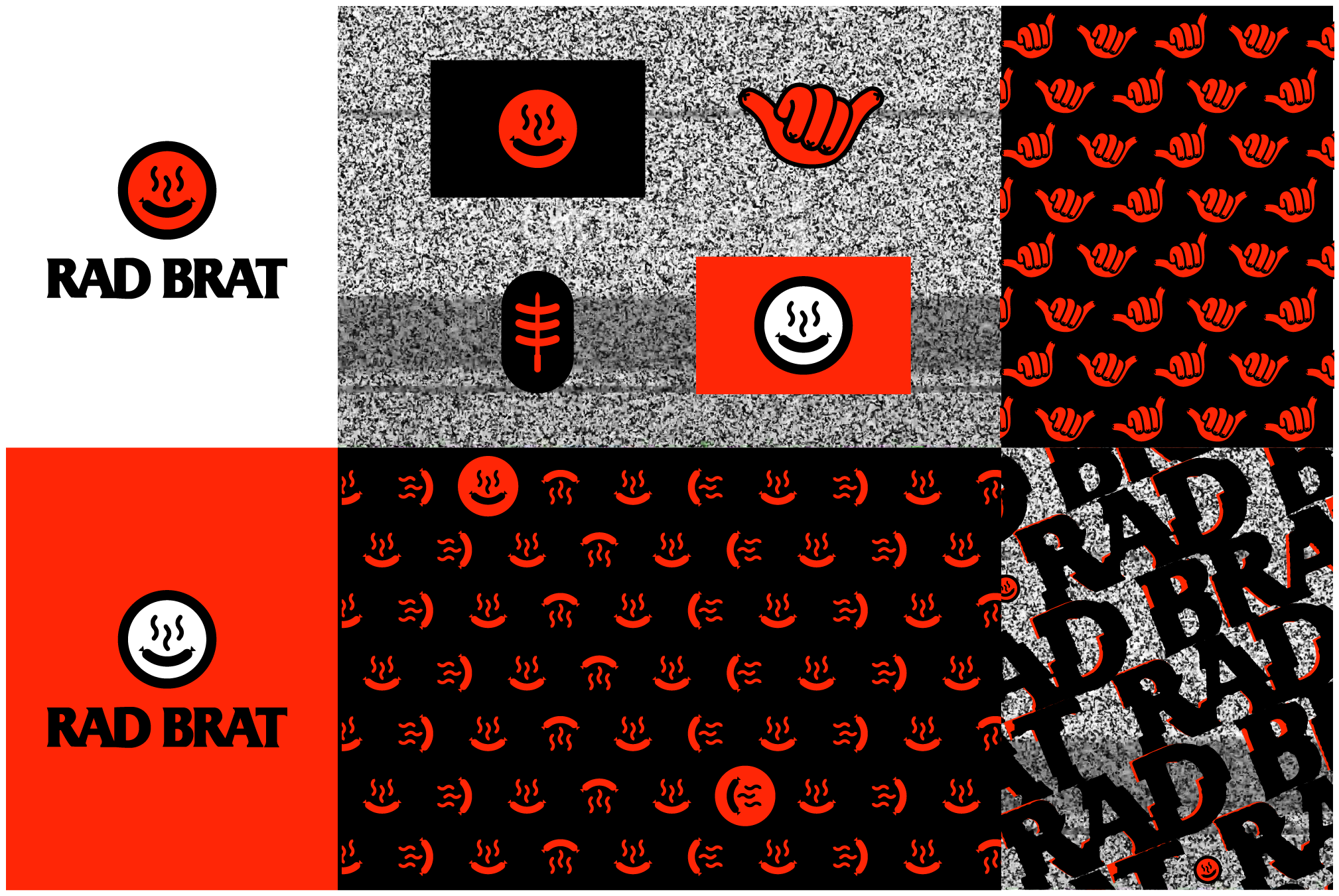
Rad Brat was started by a group of owners who came from the Punk Rock scene. They wanted their brand, and customer experience to reflect that same punk rock vibe.
Rad Brat Identity
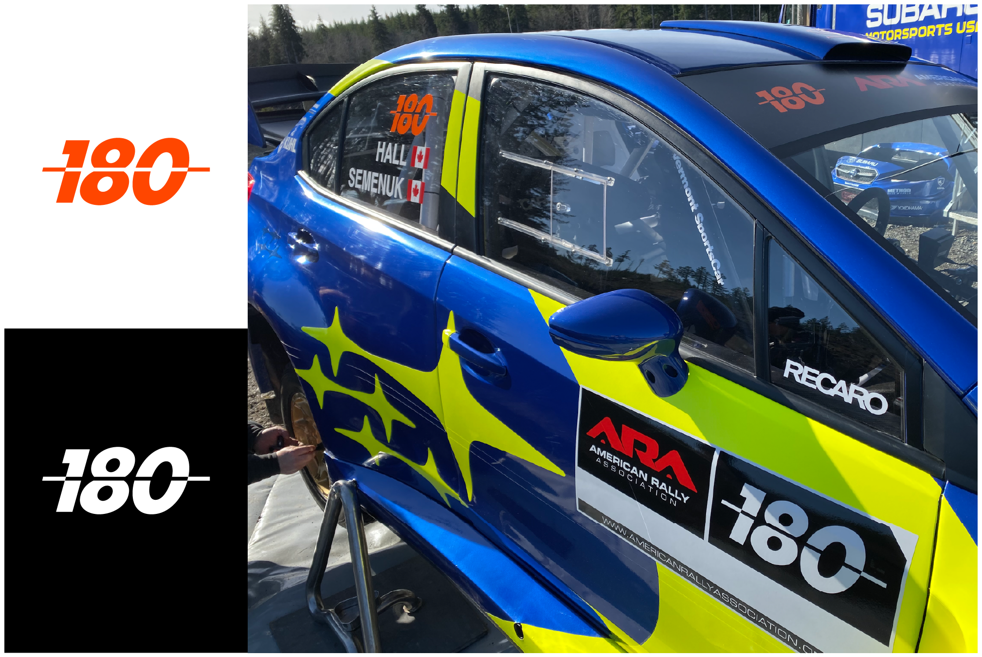
Brandon Semenuk needed a new race # identity to represent him on his car, merch and collateral as he took on the ARA with this new Subaru Motorsports USA team.
Brandon Semenuk #180 Identity
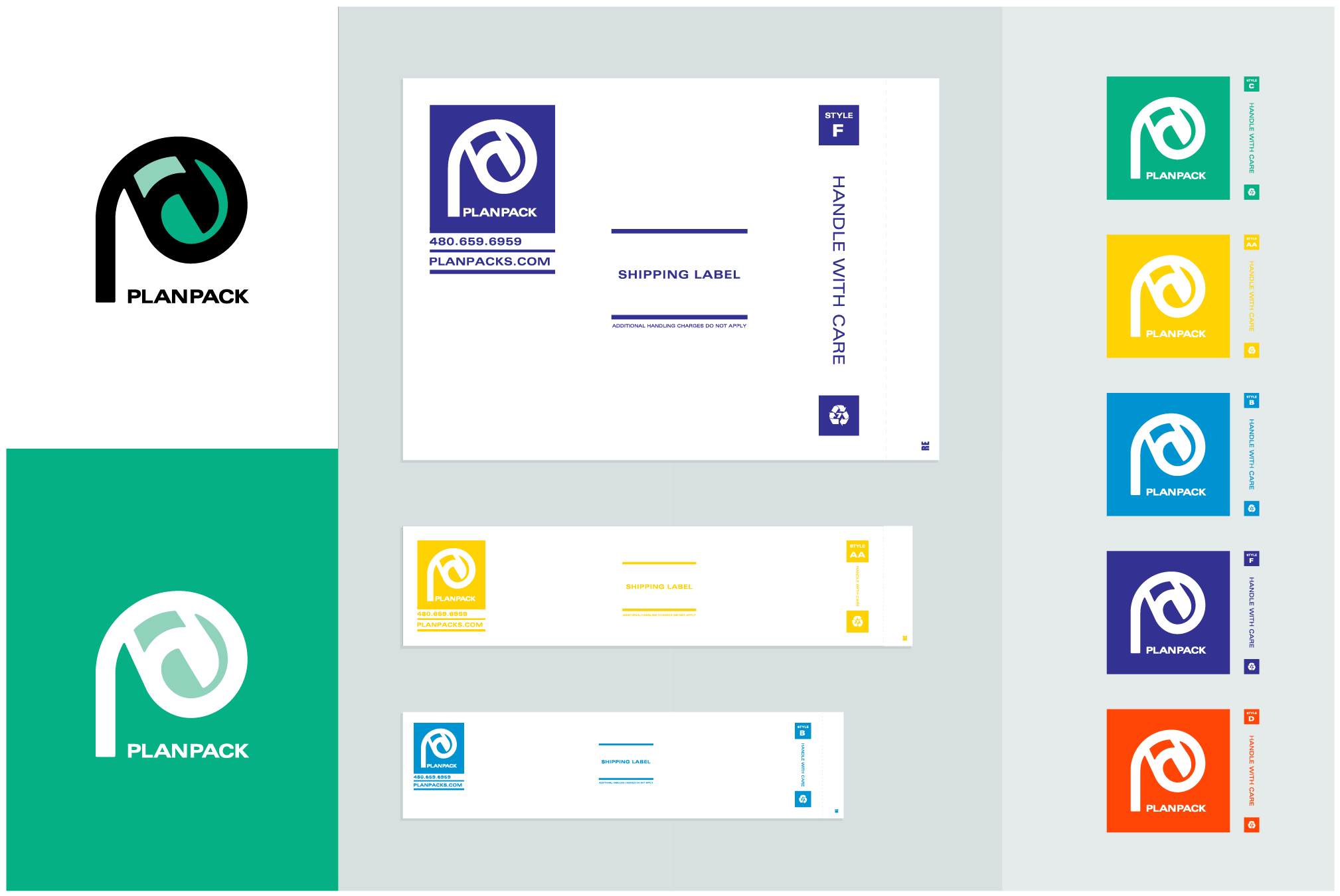
Planck still does things the old school way. Selling shipping envelopes and packaging to their architecture clients for their blueprints. They needed a visual brand update, so we created a fresh logo mark, and design system for their catalog of packaging.
Planpack Identity
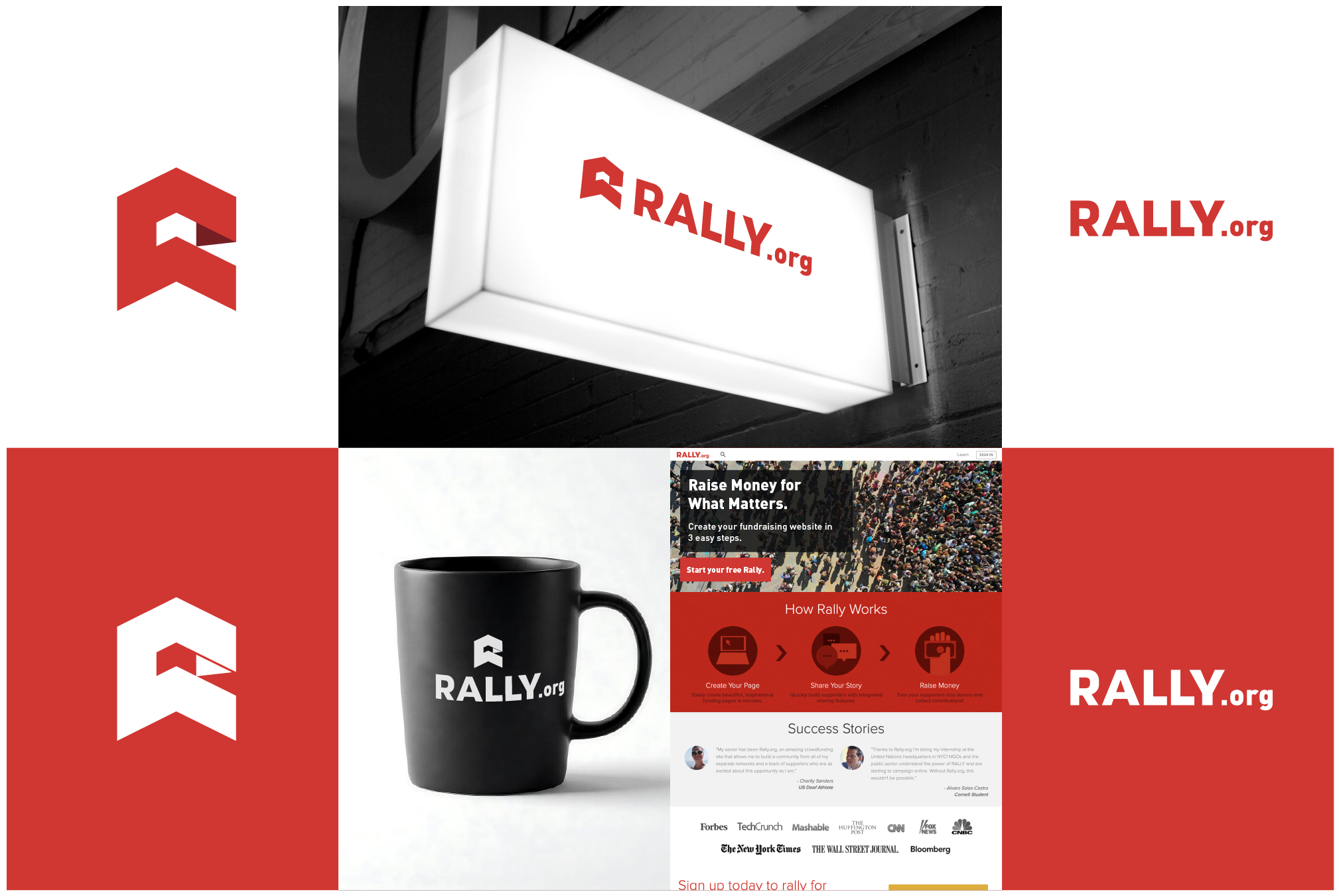
Rally.org is a crowdfunding website where you can raise money for a cause or charity of your choosing. Rally.org needed a new icon to help extend their identity system, and create a more dynamic mark for their audience to identify them.
Rally.org Identity
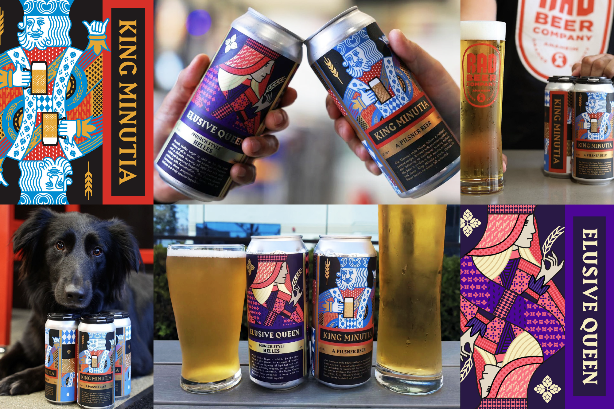
Rad Beer makes some of the best award-winning beer in Southern California. They reached out needing new branding for their two flagship brews, King Minutia and Elusive Queen. The feedback from their distributors and the sales increase in market for these beers showed that the new label designs are doing their job.
Rad Beer King Minutia & Elusive Queen Branding
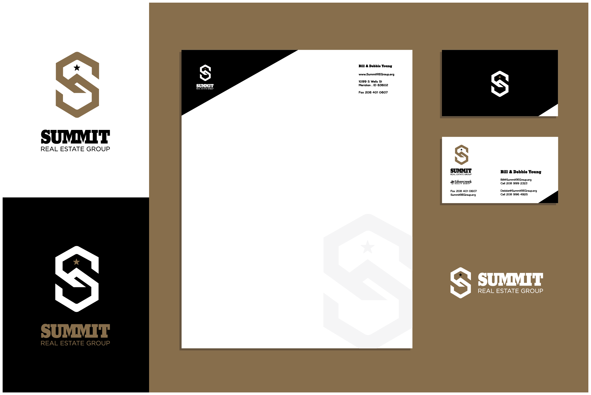
Summit Real Estate Group out of Idaho needed a new identity. The final logo mark was inspired by the name, and the surrounding topography of Idaho.
Summit Real Estate Group Identity
IDENTITY PROCESS
We’ve been doing this awhile, and we have a blue-print to make each project fun, rewarding and successful for our clients. From introductions to delivery, each stepped is defined.
-
First things first, we’ll jump on a phone call, or meet in person to talk big picture needs, and introduce ourselves.
-
At our next week you will be presented a project proposal that defines scope, timeline and costs. At this time we can make adjustments, and then proceed to signing the contract so the fun can begin.
-
We will then dive deeper into who you are, what your vision for success looks like, and get to know you, your brand and your product and/or services a little better. We would like to meet with all decision makers and stakeholders at this milestone.
-
If you project scope includes Brand Strategy, we’ll take a look at your existing brand, if it exists, get to know your worthy rivals, and begin to define what we want your brand values, voice and vibe to be moving forward.
-
Before the design work begins, we will present to you some visual mood and inspiration boards to confirm alignment on the visual direction of the project.
-
The title says it all. Time to work. Your identity will begin to come to life. All of the communications, research and alignment tools we have learned to this point will drive our creative direction, and it’s time to begin designing. Timing will be dependent on project scope.
-
Your identity, applied to real world executions. We want you to be able to envision your new identity on relevant collateral to you business. We will present you logo, color, and voice applied to these mock-ups.
-
The grand reveal to all the key stakeholders. You will be presented the final 3 unique identity directions. This is your time to see the possibilities and future of your visual brand come to life. An email recap will be sent to go over what was discussed, and a PDF copy of the presentation will be included.
-
Next steps will be to consider and talk through any feedback you might have for the direction you choose to go. The goal here is to hear your thoughts, and get to a final approved design. Two rounds of revisions are included. If there is a need for further revisions, there will be extra fees applied.
-
It’s time to deliver your new identity, logo asset files, and the brand guidelines document that defines color, typography and use-case scenarios. This is also a good time to kick off the first round of new projects to help launch your new identity, like print collateral, web assets, product swag, marketing materials etc.